January is peak why‑does‑my‑kitchen‑feel‑tired energy. The good news: a backsplash refresh can change the whole mood without a full renovation meltdown.
Here are the backsplash directions showing up in 2026, plus how to pick one that fits budget and tolerance for grout cleaning.
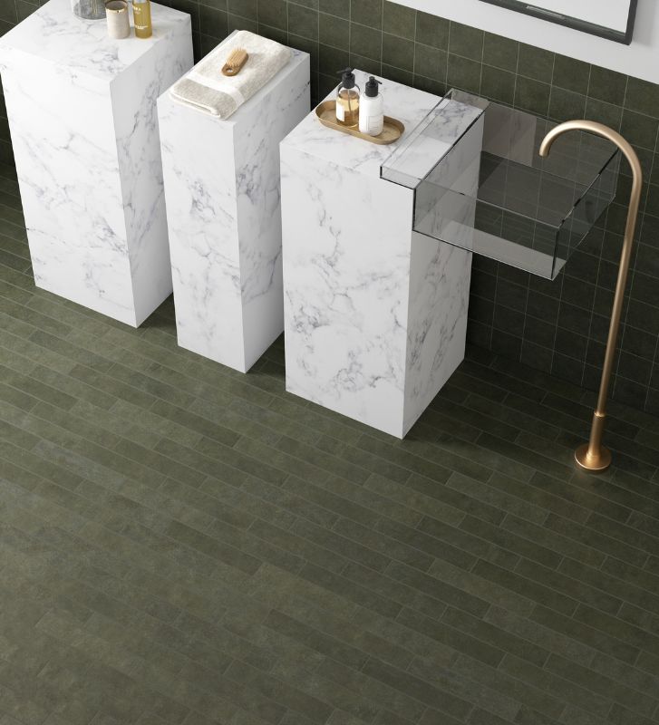
Trend 1: The slab‑look backsplash
Minimal lines, maximum calm. Designers are leaning into carrying countertop material up the wall for a seamless, cohesive look. Fewer grout lines, less visual clutter, easier to live with.
TileTown‑friendly ways to get the look
If a natural stone slab isn’t in the plan, porcelain slabs or large‑format porcelain can mimic stone visuals with less maintenance and often a friendlier price point. Good for messy cooks, minimalists, or anyone who has whispered I hate cleaning grout into the void.
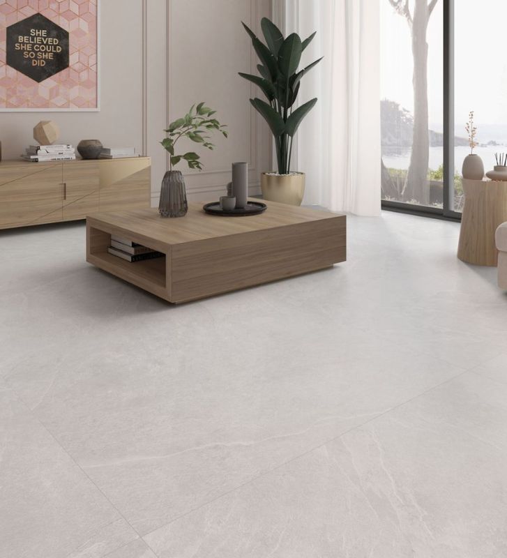
Aura Canvas Matte 12×24 Glazed Porcelain Tile
- Large, soft stone‑look tile that reads clean and calm, perfect for a slab‑style layout. Matte finish, usable on both floors and walls, so it carries a cohesive aesthetic from counters to backsplash or even adjoining floor.
- Works especially well with warm whites, greiges, light woods or natural oak cabinets.
- When you want the sense of a single, quiet plane rather than a busy mosaic, this reduces visual noise and looks timeless.
Design tip: use same or similar tile on the counter return or small wall to keep the seamless look, then add texture elsewhere, like wood shelving or brushed metal hardware.
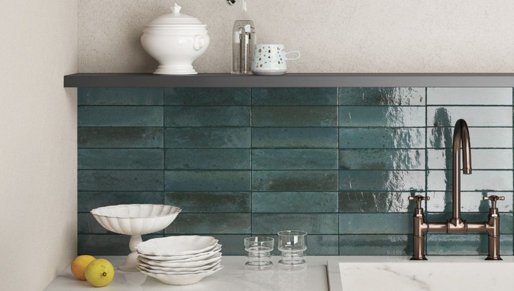
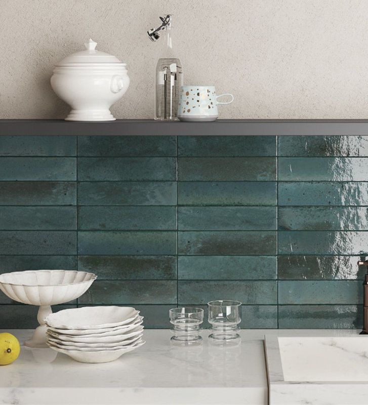
Trend 2: Handmade‑look texture
Zellige energy without preciousness. Natural variation catches light, adds movement even in a single tone.
How to make it feel current, not chaotic:
- Choose one tone and let texture do the talking
- Keep grout close to tile colour for a softer, longer‑lasting look
- Consider a classic layout such as stacked or simple brick so variation stays the star
Good for renters‑turned‑homeowners, design people, anyone craving warmth without a loud pattern.
Great picks right now
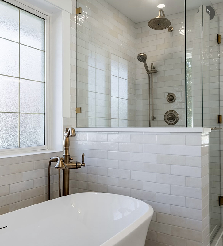
No. 1 Bestselling Tile of 2025
Design & Tiled by @dueckbuiltcontracting
Artisan White Glossy 2.5×8
- High‑gloss, artisan‑style subway with tonal variation that adds depth without needing multiple colours. If you want texture and a touch of colour in 2026, this keeps the wall engaging but not fussy.
- Works beautifully behind a neutral counter or wood cabinetry, especially when grout matches or is just a shade off.
- Also practical: glazed porcelain, so easier to wipe clean than many natural clays.
Stage Forest 2.5×12 Glazed Porcelain Tile
- Textured, earthy tone subway that’s on sale right now, recently marked down. A subtle, moss‑to‑stone colour that feels warm and natural, great for the January refresh moment.
- Matte finish, good for both walls and floors, but perfect for backsplash when you want something organic under a kitchen light.
- Because it’s a classic subway plus natural variation, you’ll get current texture without the backsplash punishing you on cleaning or style.
Layout tip: staggered brick or slight stack both work. Forest tones pair well with black or brass hardware, or simple white counters.
Trend 3: Warm colour is back
Goodbye all‑white everything. 2026 kitchens are moving toward warmer neutrals and richer, moodier tones. Creamy whites, taupes, sand, deep greens, and grown‑up muddy pastels.
Backsplash ideas that play nicely with warm colour:
- Warm white that feels creamy, not clinical
- Earthy beige or sand tones with subtle variation
- Deep green or oxblood accents in a smaller zone such as a niche or behind the range
Bonus colour option
Lume Blue 2.25×9.375 Gloss Glazed Porcelain Subway Tile
- If you want a single accent zone not neutral, this deep, jewel‑like blue keeps the backsplash lively but still elegant. Gloss reflects light, great for smaller or darker kitchens.
- Works in a stripe, a framed niche, or a slim band above a dark counter.
- Pair with warm whites or soft stone visuals elsewhere to avoid looking cold.
Colour pairing tip: keep the largest surfaces neutral or natural, then add a single accent wall, niche, or coffee bar splash with colour. It keeps the kitchen from feeling loud in the long run.
A quick, no‑regrets backsplash checklist
Before you fall in love with a tile at 11:47 p.m., do this:
- Look at your countertop first. Busy counters usually want calmer backsplash choices.
- Decide your vibe: seamless, textured or colourful.
- Pick grout on purpose. Matching grout is easier to live with, ages better.
- Order a sample, then view it morning and night. Lighting changes everything, especially in January.
The 30‑minute Is‑This‑Worth‑It test
Tape a piece of paper to the wall roughly the size of your future tile area and live with it for a day. If even a blank rectangle makes your kitchen feel more intentional, congrats: you’re backsplash‑ready.
If you want, tell us your counters and cabinet colour—something like white quartz + oak or black granite + white cabinets—and we’ll suggest three directions that fit 2026 trends without feeling try‑hard. Call or visit your local Tile Town for a complimentary design consultation.