Monochromatic interiors have been one of the most consistent home décor trends throughout 2022 (among the many other design trends that have populated this year). This look is achieved by keeping a consistent colour palette and decorating floor-to-ceiling within that one colour’s values. The aesthetic not only utilizes cohesion, but it’s also an easy starting point for first-time designers to work around — all you have to worry about is one colour!
To help you realize your monochromatic look, here are five helpful tips to consider with your tile selection.
- Remember: You’re not limited to black and white
A major misconception about the term “monochromatic” in the interior design world is that it strictly implies black and white. This could not be further from the truth, as monochromacy relies on picking one colour and working outwards around that colour, not just a grayscale palette.
Liven things up with a deep blue tile (like those found in our Teramoda series) in a room with navy walls, or experiment with a rich green (like those found in our Lume series) to coincide with the earth tones in your furniture and décor. - Use different tones and shades for depth
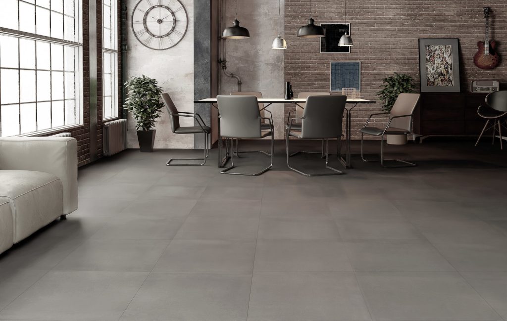
Although monochromic implies one colour, that doesn’t mean you have to limit yourself to one colour value! By adding different tints, shades, and tones, you’ll not only be creating layers within your monochromatic design, but you’ll be ensuring your colour scheme keeps from being too monotonous and boring.
Try using an ash grey floor tile (like our Geotech Grigio 12×14 Porcelain tiles) with a light grey kitchen backsplash (like our Arvex Victorian Grey Glossy 2×4 Beveled Porcelain Mosaic tiles) to give off a chic, complimentary look. - Experiment with finishes, textures, and patterns
There are many other ways you can create more excitement within your single colour-parameters. Textures can help add more noise to a quiet palette by capturing the light differently, while patterns are an easy way to add visual intrigue. (Just be sure to educate yourself on the different pattern types and how to incorporate them before you start your project!)
You can try mixing gloss and matte finishes to give the eye more texture to interact with. This will make the single tone-look feel more enticing. A great location for this would be around a fireplace — just be sure to consider the appropriate factors when choosing your fireplace tiles. - Select colours based on desired mood
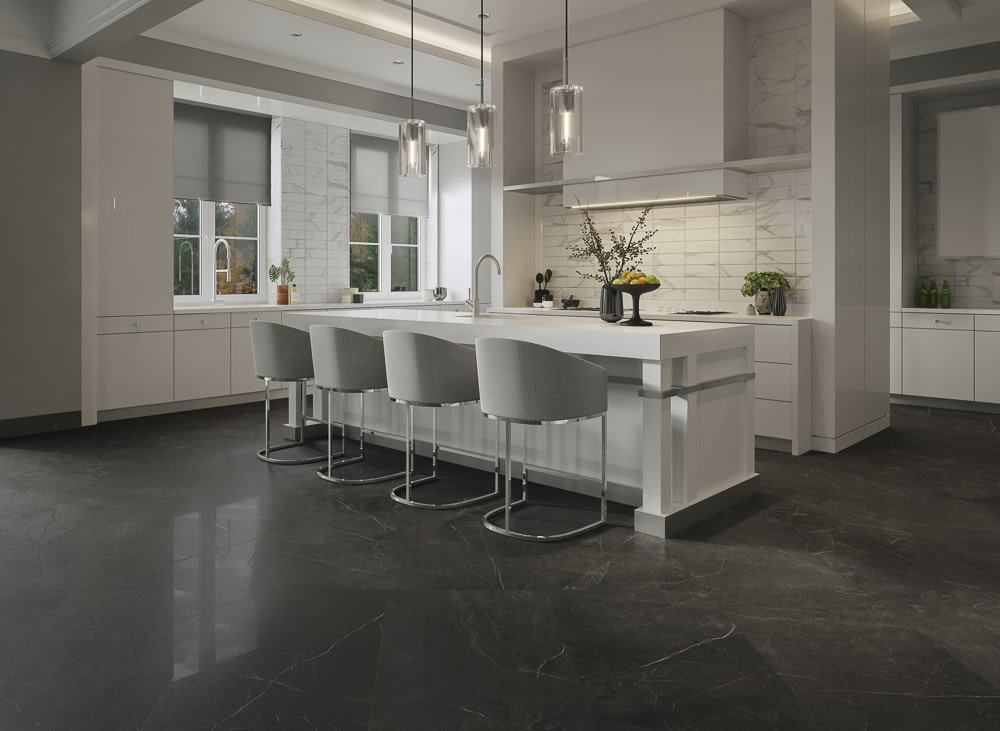
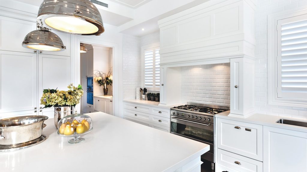
Colours have the remarkable ability of impacting how we feel (which is something we’ve discussed when choosing coloured tiles vs. black and white). Using this knowledge can help you decide what kind of mood you want your monochromatic room to emulate. An example of this is a white monochromatic look.
White can mean:
– Simplicity, which is best represented through the minimalism design aesthetic
– Cleanliness, shown through sleek white grout lines and polished-looking tiles
– Serenity, which is evoked through openness and spaciousness that’s achieved with white floor and kitchen tiles
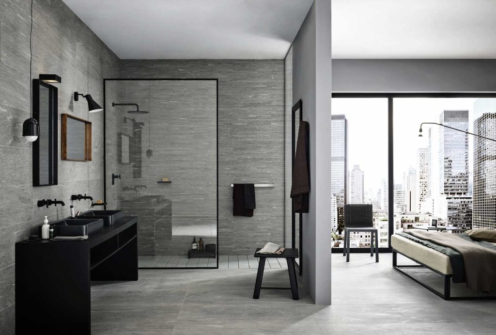
Another example of this can be seen in green tiles, which can mean:
– Nature, which would be perfect for cottage or barnyard interiors
– Healing, as the colour green is a restful colour for the eyes
– Peace, which someone can feel while surrounded by plant life and dark green furniture in an office - Match your grout lines with the tiles
An easy way to create a streamline single colour-scheme is by ensuring your grout lines match the colour of the tiles you’re using. Your grout lines will fade into the background, giving the illusion of one cohesive surface.
If you’re wanting to use a white colour scheme but are anxious about maintaining your grout line’s cleanliness, Tile Town provides many cleaning products precisely for maintaining the crispness of your grout lines, and we have many cleaning tips that can help you as well.
For more tips and tricks, visit any of our Tile Town locations, or give our stores a call!